Equalize

A tablet application where accessibility and design is made easy
to assist those with Monocular Vision Loss.
Design Challenge
The challenge was to design for a person with a specific disability or impairment in the form of either a mobile or tablet application that makes use of and is accompanied by wearable technology.

Accessibility design is a very important aspect when designing for those with disabilities or impairments. It is important to provide a solution that allows universal accessibility design for any type of user.
| PROBLEM: People with Amblyopia or Monocular Vision Loss struggle with eye strain and discomfort from frequent head turning to check their blind spots.

| DESIGN FRAME: How might we assist those with monocular vision loss to possibly improve their vision and to prevent future discomfort or eye strain?

| INTENDED SOLUTION: An application that makes use of wearable tech to detect objects around him and gives him exercises that might help prevent his vision from deteriorating even more.

USER Persona

This persona is an important document as it allows the designer to identify who and what they are designing for.
By giving a view of the community or user's background and their goals, it assists the project in finding a possible solution so that the user can achieve their goals.

Key Insights

What is Monocular Vision Loss?
Also known as Amblyopia, it refers to having useful vision in only one eye. It can be partial (some vision remaining in the affected eye) or complete (absolute vision loss in one eye).
Does it Mean a Person
is Blind?
It does not mean a person is medically blind.

Being blind refers to complete vision loss in both of your eyes.
What does Monocular Vision Loss Affect?
It can affect a person's depth of perception, as well as their peripheral vision.

It is important to note that is does not mean a person with this impairment is blind and can't function normally.

Doodle some Designs!

Crazy eights is a great idea if you are having creative block when designing certain screens.
The first step when designing is sketching what comes to mind and to figure out the layout of your design screens.

Going with the flow!

Wireframes and wire flows showcase the user's journey throughout your application design. This step in the design process allows the designer to figure out any last changes that need to be made so that the user can easily navigate through the application.

Styles Tile

This focuses on the typography, imagery, icons, UI elements and navigation used within the visual design solution.

Final Visual Designs

Onboarding
Once the user has opened the app, first time users can sign-up and current users can login. They can also select 'Remember Me' so that they don't have to sign in every time they open the app.

Keyboards are also available to type or to use text-to-speech.
Eye Exercises
They will be presented with the Home Screen once logged in.

They can select the first feature: Eye Exercises, where they can then select which type of exercise they would like to do.

They can either start the exercise or find out how to do the exercise and how it assists them.
Walking Routes
Walking routes can be used for safer walking.

The user can connect their smart watch to the application, select their route and the watch will show the route on their smart watch for when they start their walk.
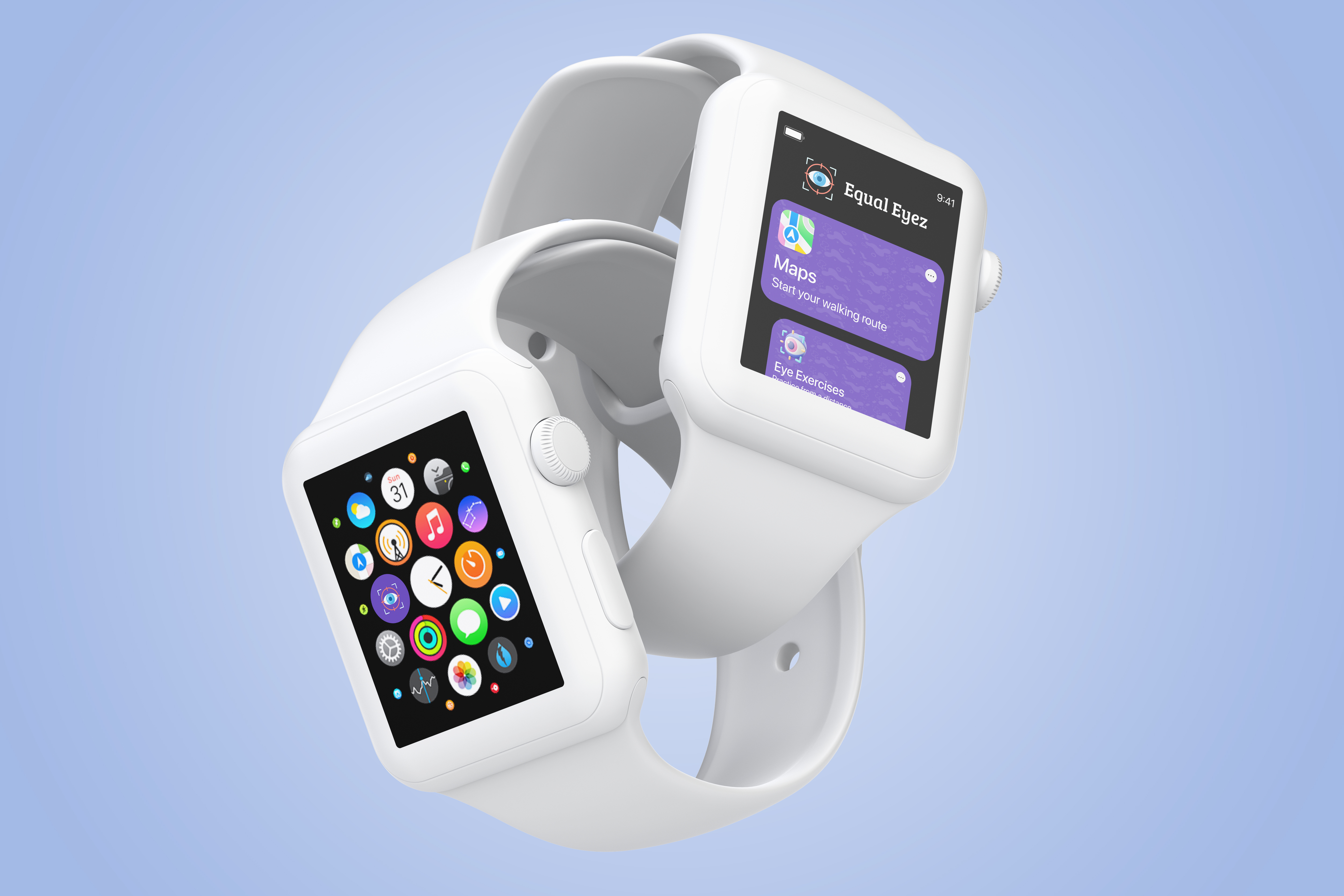
Wearable Tech
The user can select the app on their smart watch and click 'Maps' to start their walking route.

The watch directs and shows the user where to walk and alerts them when to turn.

The watch also warns the user if their blind spot in their peripheral vision might block them from seeing cars.
Reading
The user also has the reading feature.

They can download books or read current books.

To prevent eye strain and discomfort, the user can switch on 'True Tone' as it is much better on the eyes and reduces strain.
Eye Testing & Settings
Being able to adjust settings such as text size and colour schemes allows for more accessibility within the application.

The user can also test their eyes, making use of optical illusions and more.

The user is able to adjust these settings under the settings section.

So, what's next?

Project Learnings
Designing for accessibility is not always easy,
I have learnt there is a lot that you need to consider.

Accessibility tools such as colour contrast can teach you
a lot about which colours work and which don't.

When designing for native platforms such as iOS,
it is always important to stick to the guidelines such
as text and button size.
Next Steps
Exploring more about accessibility and improving my designs according to universal accessibility design guidelines.

Ensuring that when designing for native platforms that guidelines are followed to ensure consistency in the design and the platform's brand.